African StoriesHistory & Documentaries
Why the World Just Voted to “Correct the World Map” – And Why the Map of the World You Grew Up With Is Wrong
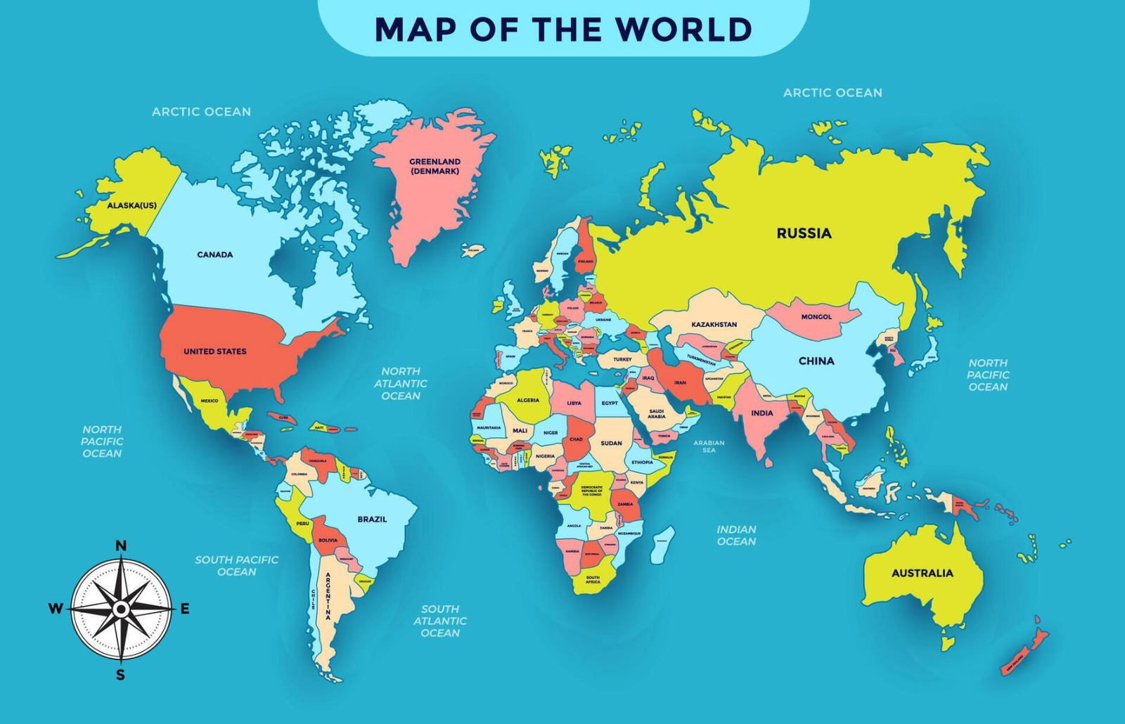
Look at almost any world map you’ve ever seen; the one on your classroom wall, in your atlas, on Google Maps. Greenland looks about the same size as Africa. It isn’t. Africa is roughly 14 times bigger than Greenland. Not a little bigger. Fourteen times.
That’s not a rounding error. It’s one of the most consequential distortions in the history of the map of the world, and on September 4, 2026, the United Nations officially did something about it.
The world map you grew up with is wrong
The world map most of us know is called the Mercator projection, created in 1569 by the Flemish cartographer Gerardus Mercator. It’s the map of the world behind your phone’s navigation app, your textbooks, and the poster that’s probably still hanging in a classroom somewhere near you.
Here is a Video explainer
Mercator built his world map to solve a real problem: helping ships sail in straight compass lines across the ocean. But to make that work, he had to stretch landmasses the farther they sit from the equator. The result is a map of the world where Greenland balloons into a giant, Russia looks enormous, and the U.S. and Canada appear to span more than half the globe. In contrast, Africa, home to more than 50 countries and roughly 1.5 billion people, shrinks to a fraction of its real footprint.
Once you strip away the distortion, the real picture is staggering. You could fit the entire United States inside Africa, add China, Japan, and Mexico, and still have room to spare. Greenland, that “giant” at the top of the world map, is actually about the same size as just one African country, the Democratic Republic of the Congo.
A widely shared visualisation makes this even clearer: 31 countries from North and South America, the U.S., Canada, Mexico, Venezuela, and dozens more, fit inside Africa’s borders with space to spare. Combined, those 31 countries cover about 28.04 million square kilometers. Africa alone covers 30.37 million. That leaves roughly 2.33 million square kilometers of space — enough to squeeze in about 84% of Argentina before the continent is full.
It’s not just about size – it’s about perception
A world map doesn’t just show us where places are. It shapes how important we think those places are.
For 450 years, a map of the world optimized for 16th century naval navigation has quietly told generations of students which countries look big and powerful, and which look small and forgettable. That happened to align conveniently with European colonial and imperial interests at the exact moment those empires were expanding across Africa. Whether Mercator intended that effect is genuinely debated among historians, but once this world map existed, it flattered the very powers that went on to use it for centuries.
The scale of the distortion is easy to underestimate on the standard map of the world. The United Kingdom looks roughly comparable in size to Nigeria. In reality, Nigeria is nearly four times larger. The UK is actually only about half the size of Cameroon. The DRC and Algeria are roughly ten times the UK’s real size, yet the world map most of us grew up with makes them look only two or three times bigger.
The UN vote to fix the map of the world
On September 4, 2026, Togo, acting on behalf of the African Union and the Bahamas, brought a resolution before the UN General Assembly called “Correct the Map.” It calls on governments, schools, tech companies, and institutions worldwide to move away from the Mercator world map in favour of the more accurate Equal Earth projection, which preserves countries’ true relative sizes on the map of the world.
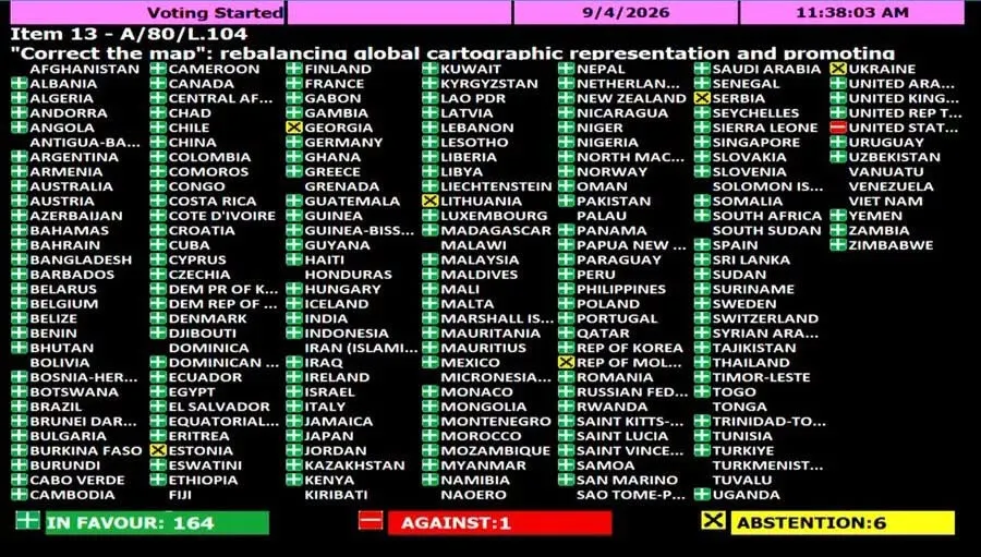
The resolution passed 164 votes in favor, one against, and six abstentions (Estonia, Georgia, Lithuania, Moldova, Serbia, and Ukraine). The United States cast the lone “no” vote.
Togo’s Minister of Foreign Affairs, Robert Dussey, framed the stakes plainly before the vote: “Maps shape our understanding of the world. They guide education, nourish the imagination, and influence collective perceptions.” In other words, this was never purely a cartography debate, it was about how the world’s map has trained people to see Africa.
Why the U.S. voted no
The U.S. objection wasn’t about the accuracy of the Equal Earth map itself. Yaryna Ferencevych, the Deputy U.S. Representative to the UN Economic and Social Council, argued that the resolution couldn’t be separated from a broader push tied to language around “reparations” and “cognitive justice.” She called it part of “a much larger and more radical ideological project,” and described such resolutions as “barnacles” weighing down an institution she said was losing credibility by debating a 16th-century world map instead of, in her words, “genuine problems of international peace, prosperity, or good relations.”
However, you can’t separate “let’s fix the map of the world” from “here’s why the map needs fixing”; the historical context is the reason the correction matters in the first place. Naming why a 450-year-old world map persisted, they argue, isn’t ideology. It’s just an accurate account of the map’s history and effects.
A modest ask, a symbolic result
It’s worth being clear about what the resolution actually does: It’s a nudge toward institutions, schools, governments and tech platforms adopting equal-area alternatives like the Equal Earth Map. France’s Foreign Minister announced, just before the vote, that Paris would move away from the Mercator world map of its own accord.
Still, a 164 – 1 vote is not a small thing. It reflects near-total global consensus that the default map of the world most of us grew up with distorts more than geography. It distorts a sense of scale, relevance, and power that has quietly shaped how people think about entire regions of the planet.
The next time you look at a world map, it’s worth asking: is this showing me where things are, or how important they are? For 450 years, those have been treated as the same question on the standard map of the world. As of September 2026, most of the world has officially decided they shouldn’t be.
Written by
Jennifer Confidence
I tell Africa’s stories, all of them. Through documentaries, travel and deep conversations, I explore everything Africa, and I share what years of crisis management taught me about travelling safely.
Keep reading
More stories
- Through the Doors of No Return: Gorée Island and the Legacy of the Transatlantic Slave TradeRemembering History at Senegal’s Most Important Historical Site Gorée Island is one of Africa’s most important historical sites. It is located off…
- Slavery and the Slave Trade: What Actually Happened, and Why It Never Fully EndedWhen did slavery end? It’s one of the most-searched questions about this history and it’s also one of the most misleading, because…
Join my newsletter
New stories, travel updates and security briefs, sent straight to your inbox.